OPPO’s previous OOH campaign for the Reno12 5G embraced a refined and minimalist concept that prioritized simplicity and sophistication. It followed the brand’s ongoing efforts to reshape the digital OOH scene with futuristic, tech-driven visuals. With a focus on clarity and elegance, the campaign successfully communicated OPPO’s innovative spirit and modern design philosophy to a tech-savvy audience.
OPPO Reno 12

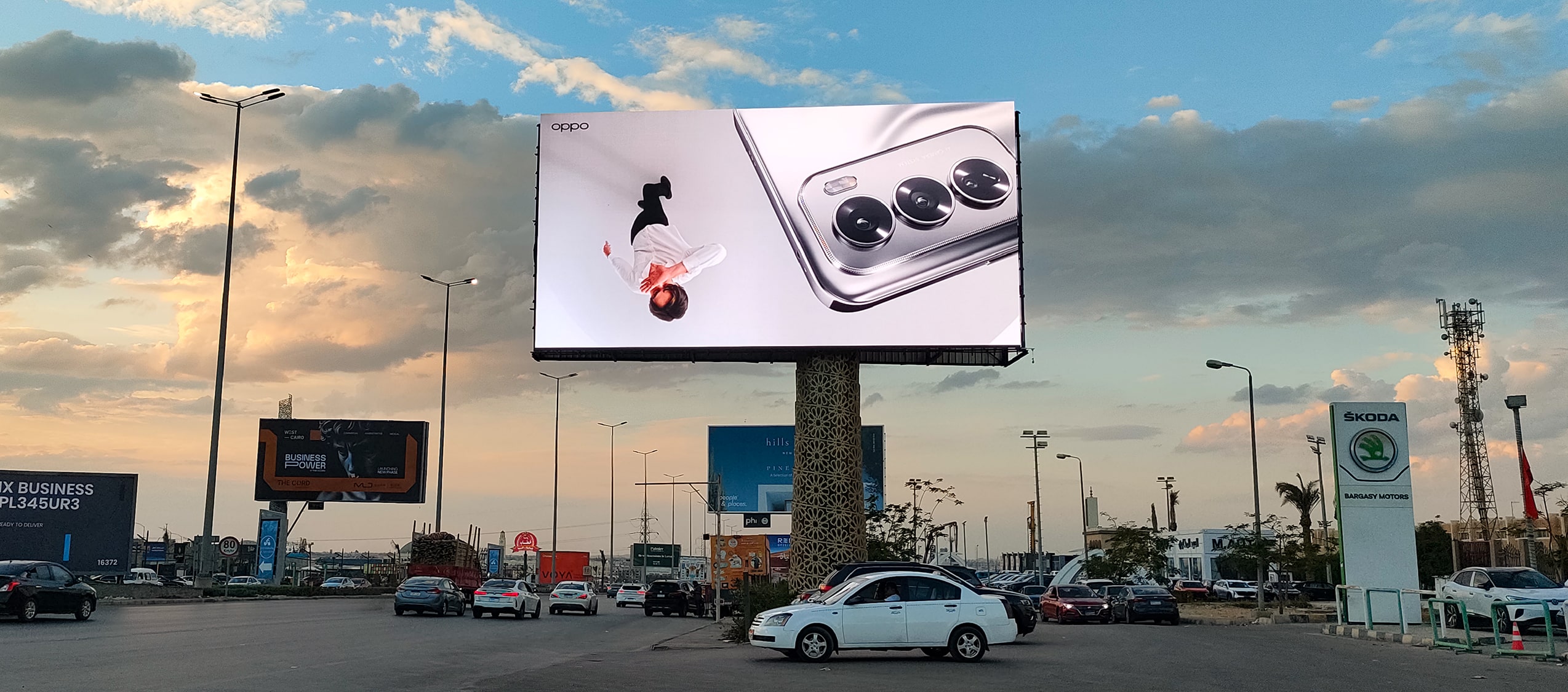
D/OOH Execution
The campaign made use of dual-panel billboards, with the top panel labeled “OPPO AI Phone” and the bottom panel showcasing “Reno12 5G” in bold, minimal typography. A close-up image of the phone’s advanced camera array was featured, subtly highlighting its powerful photography capabilities. The clean layout, free of clutter, allowed the messaging to remain sharp and visually balanced while enhancing roadside visibility and impact.


Visual Presence
This campaign marked a strategic move by OPPO toward understated elegance in a visually saturated OOH environment. By relying on a minimal design and letting the product’s aesthetic and features speak for themselves, OPPO effectively captured attention across urban spaces in the MENA region. The campaign aligned with consumer preferences for sleek, high-performance technology, reinforcing OPPO’s brand identity and the Reno12 5G’s premium appeal.
See More